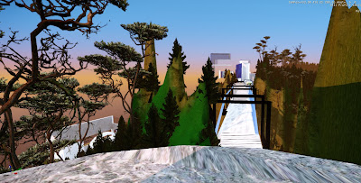
Coca Cola Headquarters
 |
| Inspiration |
To start off with my coca cola design, I've scoured the internet with graphic designs of Coca Cola bottles and advertisements, I've spotted some lively, colourful and fluid designs which assisted me and gave me inspiration with ideas of the overall design of the Coca Cola headquarters.
 |
| Coca Cola |
With my coca cola design, I've aimed in bringing the identity of coca cola to come forth, I've also kept in mind the concept of power, with the word that I've chosen which I think represents 'power' in its greatest sense is the word "domination" So with that in mind, I've opted to bring forth a hierarchy, in which the VIP's or "CEO's" are at the top of building, the people who's positions come directly below the CEO's are situated under the very top room. and ofcourse the workers/employees are at the bottom of the building where the transparent tube-like building is situated.
Facebook Headquarters
 |
| lunch room |
 |
| entertainment room |
 |
| production room |
I have found some photos of the existing facebook headquarters that reveal how they are comfortable with the setup of the spaces. I have found that separate spaces work best in the setup of the headquarters that I will be designing, at first I was planning on making one big open space for the employees to work, but finding these photos has assisted me in generating the idea that allocated spaces would suit facebook.
I've created the HQ of facebook with the idea of it being a social network, which is why the front of the building is completely made of glass which is a symbolic meaning of facebook as a company being able to connect people through the use of internet.
However, when the HQ is viewed from the side, it showcases my custom material. The reason why it is not glass too, is because I used the HQ to showcase a dual meaning, whilst facebook allows people to interact by liking posts or commenting on 'walls', it does not necessarily assist people in getting to know eachother personally.
The Bridge
The Elevators
The elevators are made of marble, the symbolic meaning of power is found throughout the design of the elevator starting with its material being marble, an expensive and very high-class material to use. I see power as being heavy and robust, which is exactly what the elevator seems to depict.
The Dining Table
The dining table is encased in a space of its own. The VIP's will have to walk through an exclusive walkway, guided by the lights that will be placed on the arches, leading up to stairs which lead to the dining table. The dining table has a 'dominant' and powerful look. Firstly, with the material being stone which carries out the heavy feel as well as the sleek edges of the dining table which evike an almost agressive tone to the room.


